Exploring Different Color Schemes and Their Impact on the Finished Piece?
Color is an essential element of art that holds the power to convey emotions, set moods, and captivate audiences. As artists, we wield the palette like a magician’s wand, using colors to breathe life into our creations.
The way we combine and arrange colors can significantly influence the overall impact and message of our artwork. In this article, we embark on a journey of exploration, delving into the world of different color schemes and uncovering their profound effects on the finished piece.
The Importance of Color Schemes in Art
Imagine a world without color harmony. A painting with clashing colors might leave us puzzled, and an illustration lacking a cohesive palette could fail to evoke the desired mood. This is where color schemes step in as our guiding stars. They provide a structured approach to selecting colors that not only complement each other but also enhance the overall visual experience.
Understanding Color Theory
The Basics of Color
Before we dive into the intricacies of color schemes, let’s revisit the basics. Colors can be broken down into three fundamental properties:
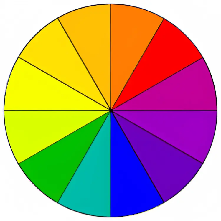
Color Wheel: A Guide to Harmonious Combinations
The color wheel serves as our compass in the world of colors. It organizes hues in a circular arrangement, showcasing their relationships and interactions. One of the most common color wheels is the RYB (Red, Yellow, Blue) model, widely used in traditional art. However, digital artists often work with the RGB (Red, Green, Blue) model, which corresponds to light emitted by screens.
The Role of Value, Intensity, and Hue
Color schemes go beyond simply selecting hues; they involve balancing intensity and value as well. By playing with these three variables, artists can create captivating visuals that lead the viewer’s eye and convey specific emotions. For instance, altering the value and intensity of a hue can shift its mood from vibrant to subdued.
Types of Color Schemes
Artists have devised various color schemes to guide their creative choices. Each scheme offers a distinct visual experience, and understanding their characteristics can empower artists to make informed decisions.
Monochromatic Harmony
A monochromatic color scheme revolves around a single hue, varying only in intensity and value. This creates a sense of unity and simplicity, making it an ideal choice for conveying a tranquil atmosphere or focusing on specific details.
Analogous Bliss
Analogous colors sit adjacent to each other on the color wheel. This scheme creates a harmonious blend, often found in nature. Analogous colors work well together, evoking feelings of warmth and comfort.
Complementary Contrasts
Complementary colors lie opposite each other on the color wheel. When combined, they create strong visual contrasts that demand attention. This scheme is excellent for highlighting focal points and adding dynamic energy to a composition.
Triadic Adventures
Triadic color schemes involve selecting three evenly spaced hues on the color wheel. This approach offers a balanced yet vibrant palette that can be used to create striking compositions.
Split-Complementary Surprises
A split-complementary scheme takes a complementary pair and adds adjacent hues to each of them. This softens the contrast while maintaining visual interest. It’s a versatile scheme that provides both harmony and variety.
Tetradic Exploration
Tetradic color schemes involve selecting two complementary pairs, resulting in a palette of four hues. This scheme offers a wide range of possibilities and allows for intricate compositions with balanced color relationships.
Evoking Emotions with Colors
Colors have the power to evoke emotions, trigger memories, and convey messages without a single word. By understanding the psychological and cultural associations of different colors, artists can harness their emotional impact.
Warm vs. Cool: The Temperature of Feelings
Warm colors, such as reds, oranges, and yellows, evoke feelings of energy, passion, and warmth. On the other hand, cool colors like blues and greens induce calmness, tranquility, and a sense of distance. Knowing when to use warm or cool hues can significantly enhance the emotional resonance of a piece.
Cultural and Psychological Color Symbolism
Colors hold diverse symbolic meanings across cultures and contexts. For example, red can represent love and luck in one culture, while symbolizing danger and warning in another. Additionally, colors can trigger psychological responses; blue may be associated with trust and reliability, while black might evoke feelings of mystery and authority.
Creating Impactful Illustrations
Color schemes are not mere guidelines; they are tools that artists can use to create impactful illustrations that resonate with viewers on a deeper level.
Using Color Schemes to Set the Mood
Color schemes play a pivotal role in setting the mood of an artwork. Imagine a sunset scene painted with cold, muted tones – it may lose the warmth and magic associated with sunsets. By selecting an appropriate color scheme, artists can effectively convey the desired mood, whether it’s serene, dramatic, or joyful.
Enhancing Depth and Dimension
Colors are powerful aids in creating depth and dimension in artwork. By using value shifts, artists can make objects appear closer or farther away. This technique, known as atmospheric perspective, relies on warmer and more saturated colors for foreground elements and cooler, desaturated colors for background elements.
Capturing Attention with Focal Points
A well-executed color scheme can guide the viewer’s eye toward a focal point within the composition. By using contrasting colors or highly saturated hues, artists can ensure that certain areas of the artwork receive the attention they deserve. This strategic use of color contributes to the overall narrative and impact of the piece.
Practical Steps for Crafting Color Schemes
Creating an effective color scheme requires a structured approach. Here’s a step-by-step process to help artists craft compelling color combinations:
Step 1: Selecting the Dominant Hue
Start by choosing a dominant hue that sets the tone for the artwork. This hue will be the primary color that defines the overall palette.
Step 2: Adding Supporting Colors
Once the dominant hue is chosen, select supporting colors that complement it. These colors can be analogous, complementary, or part of another scheme. They will add depth and variety to the composition.
Step 3: Balancing Intensity and Value
Experiment with the intensity and value of each color in the scheme. Consider using higher intensity and value for focal points and areas of interest, and lower values and intensity for background or less prominent elements.
Step 4: Test and Refine
Test the color scheme in different lighting conditions and contexts to ensure its effectiveness. Make adjustments as needed to achieve the desired visual impact.
Case Studies: Applying Color Schemes in Art
Let’s explore how artists apply color schemes in different artistic contexts:
Comic Illustration: Conveying Atmosphere and Emotion
In comic illustration, color schemes can be used to convey the atmosphere of a scene and evoke specific emotions. A monochromatic scheme with blue hues might create a serene nighttime setting, while vibrant reds and oranges can heighten tension during a climactic moment.
Character Design: Portraying Personality Through Colors
When designing characters, color schemes can reveal aspects of their personality and traits. A cheerful character might be adorned in warm, inviting colors, while a mysterious figure could be cloaked in deep, enigmatic hues.

Concept Art: Creating Worlds with a Palette
Concept artists use color schemes to bring imaginary worlds to life. By selecting the right colors, they can evoke the ambiance of a fantastical landscape or the futuristic aesthetics of a sci-fi cityscape.
Overcoming Challenges in Color Harmony
While color schemes offer a structured approach, challenges can arise when working with diverse palettes or complex scenes.
Dealing with Color Clashes
Sometimes, colors that theoretically work well together might clash in practice. Artists need to trust their instincts and make adjustments to find the right balance.
Harmonizing Colors in Complex Scenes
In complex scenes with multiple elements, harmonizing colors can be a challenge. Artists can achieve harmony by establishing a color hierarchy, where certain colors dominate while others serve as accents.
Achieving Unity in Diverse Color Palettes
When working with diverse color palettes, achieving unity can be tricky. Anchoring the composition with a dominant color and using harmonious supporting colors can help create a cohesive visual experience.
Conclusion
In the realm of art, color is a potent tool that artists can use to elicit emotions, convey messages, and create captivating visuals. Exploring different color schemes opens a world of possibilities, allowing artists to craft artwork that resonates deeply with viewers.
By understanding color theory, experimenting with diverse schemes, and harnessing the psychological impact of colors, artists can elevate their creations to new heights. So, the next time you approach a canvas or digital screen, remember that every brushstroke or pixel holds the power to tell a vivid and colorful story.